Posts Tagged ‘GIS’

PURPOSE
To test the feasibility of a low cost, mobile environmental sensor system that could be used to sample air quality as needed and in areas where conventional sensor systems may not be available or cost effective.

METHODOLOGY
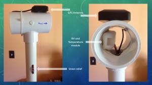
Based around the low-cost Arduino microcontroller, a GPS shield for capturing geographic location was paired with a relative humidity and temperature sensor to act as a mobile data logger. The relative humidity and temperature sensors were chosen for their cost and ease of implementation as an initial set of sensors. The sensors were mounted at the end of a five foot long section of one-inch PVC mast inside a one-inch to two inch tee fitting. The tee fitting was used to protect the sensors from direct sunlight and weather (Figure 1).

Figure_1

Figure 1

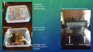
The entire unit is powered by a single 9-volt alkaline battery and housed inside a rigid plastic storage container to protect the equipment from handling and the elements. The 9-volt battery should power the unit for several hours and a 9-volt lithium may provide even more operating time (Figure 2).

Figure_2

Figure 2

Software was modified based on that supplied by Adafruit industries, the makers and suppliers of the sensors and GPS unit. The software reads the raw GPS datastream and parses out the $GPRMC string, reads the relative humidity and temperature sensor, then writes these values as a line to a comma separated value text file on a microSD card on the GPS shield. Each additional reading from the time the unit is started is appended to this text file. If power is interrupted to the unit, when it restarts it will create a new file before appending data.

ANALYSIS
For the initial test of the unit, it was placed inside a backpack with the mast rising to approximately seven feet above the ground. The trip was made on a standard mountain bike and ridden at a nominal pace. The initial test site chosen was a road that runs from north to south from West Walnut Street in Greencastle, IN to the DePauw Nature Park parking lot. There is a change in elevation of roughly fifteen feet where the road enters the forest area at the north end. Otherwise the road is nearly level throughout. The distance covered was approximately 1.7 miles roundtrip and the sensor unit gathered 1059 data points during this trip. Riding was done by staying as close as comfortable to the outside edges of the road for not only safety reasons, but to also help determine the accuracy of the GPS unit.

The unit was turned on and allowed to get a fix on the satellite constellation, then an additional five minutes was allowed to elapse to allow the sensors to acclimate to ambient conditions. Upon return to starting position, the unit was turned off and the file from the microSD card removed and the file copied off.

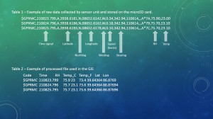
The data file was opened in Microsoft Excel and the GPRMC latitude and longitude coordinates converted to decimal degrees for use in the GIS. This was done by extracting the degree portion of the latitude string, dividing the rest of the string by 60, then adding the two back together. The temperature was also converted from degrees Celsius to degrees Fahrenheit using the standard formula. Table 1 shows a sample of the raw data file collected and Table 2 shows a sample of the finished spreadsheet.

Tables

The resulting Microsoft Excel table was then opened in ArcGIS 10.1 and the XY data used to plot the points (Figure 3).

Figure_3

Figure 3

The projection used by the GPS constellation is WAS 1984 and that was what was used here. A basemap of aerial imagery was then added for reference. Finally, the point data was buffered to 25 meters, the points were kriged, and then the kriged raster was clipped using the buffer (Figure 4).

Figure_4

Figure 4

CONCLUSIONS
This project has shown the feasibility of using low cost, mobile arduino-based devices as environmental sensor systems that could be used to sample air quality as needed and in areas where conventional sensor systems may not be available or cost effective.

Several future considerations should be considered, including increasing the number and type of sensors such as adding benzene, NO2, or similar sensors. Additional or different sensors can be added or changed out with minimal effort in programming or hardware.

Another area of interest would be to outfit similar units with small solar panels and battery backup systems so that they could be placed in remote locations, thereby increasing the ability to monitor environmental pollution throughout a much wider area.
Now more than ever, we as users of Geographic Information Systems (GIS) – both professionals and non-professionals – need to be more vigilant in our use of these technologies. Big data, satellite imagery, social media, and GIS all come together to allow an unprecedented level of information sharing that has never before been available. What sparked this blog post is in response to several tweets and retweets today regarding a map that was published online and freely viewable in response to a recent tragedy. I will not share the link or point fingers, as this occurrence is just the latest in a trend I see becoming ever more prominent.

In this particular situation, the map shared with the public shows individual victim locations of the recent tragedy down to the parcel coded level (in other words, a clickable point was placed on the roof of the victims home). Along with this highly accurate location, personal information, including whether the victim is alive or dead or missing, their address and a photograph of them pop-up when clicking on any of the points. While the people who created the map I am sure had nothing but good intentions, and felt they were respecting the victims while doing a public service, the problem is that they were clearly not trained in the ethical use of GIS technologies. I see this as becoming an ever increasing problem as more and more information is made available about our lives, and the ease of creating maps that can be shared in near-real time over the Internet by anyone with a computer continue to evolve and mature. “Just because we can map something, does not mean we should map something.” This also goes beyond improper use of GIS, but also to poor GIS. A person with no training in spatial statistics, cartography, visualization, and a host of other skills, can now sit down, put together a map in a matter of minutes and share it with the world. While this is wonderful from an open-source point of view, it can also lead to erroneous or misleading conclusions and, in this case, violations in privacy.

So rather than just rant about this, here are some things to consider and think about the next time we sit down to create a map for public dissemination.

From the GIS Certification Institute’s “Code of Ethics” under Part IV Obligations to Individuals in Society

1. Respect Privacy

  • Protect individual privacy, especially about sensitive information.
  • Be especially careful with new information discovered about an individual through GIS-based manipulations (such as geocoding) or the combination of two or more databases.

2. Respect Individuals

  • Encourage individual autonomy.
  • Avoid undue intrusions into the lives of individuals.

From “The Ethics of GIS” by Jeremy Crampton, published in ‘Cartography and Geographic Information Systems’ Vol. 22, No. 1, 1995, page 87 “In relation to infringements of privacy by spatial data collection, a commonly made counterargument is that despite the wide availability of personal information in databases, people’s privacy cannot be infringed if analysis is at the aggregate (census block or neighborhood) level. It is argued that this ensures no personal information is ever made available, and that individuals are unaffected by aggregated data.”

Finally, From “Crisis Mapping Needs an Ethical Compass” by Nathaniel Raymond, Caitlin Howarth & Jonathan Hutson downloaded from globalbrief.ca, “These new uses of crowd-sourced data, the rise of social networking, and the integration of geographic information systems with satellite imagery have not only transformed rapid responses to political unrest and natural disasters, but have in fact begun to fundamentally alter the very nature and arc of the emergence themselves.” And also in that same publication, “It must be determined whether experimental projects that use satellite surveillance, crowd sourcing and interactive map-making in new ways during a crisis constitute human subjects research, and thus require institutional review board approval and oversight.”

While I am not suggesting with that last comment that every mapping project like the one being discussed needs IRB approval, it highlights the importance of how careful we all must be before we release a map, especially during a natural disaster or other event, and consider those that are being mapped and how it will affect them and their families.

Back on January 6 of this year Kevin Butler posted a great article on converting Landsat 8 thermal bands to at-satellite brightness temperatures using the Raster Function Template Editor. The link to his article can be found here .
I will admit I have never used the raster function editor (ok, I didn’t even know it existed), so not being familiar with the raster editor, I had a hard time trying to follow Kevin’s instructions. I am familiar with ArcGIS’s Modelbuilder, though. Using the valuable information in Kevin’s article as a guide, I created a model that does the same thing. The result turned out pretty well and I have included it here as a toolbox that can be added to ArcGIS. You are free to use, modify, and/or change it all you want. All I ask is that if you find it useful or have any comments about it, let me know.
To use the tool, click on the link above and save the Landsat8.tbx file to your computer. Next, open ArcGIS and make sure the Toolbox side-panel is visible (The ESRI website has better instructions for adding toolboxes here . Right-click inside the panel and select “Add toolbox…” from the menu. Navigate to where you saved the Landsat8.tbx and select it (do not open it to show the model, just select the .tbx file). The Landsat8 toolbox is now added. Open it and inside there should be a model called LS8Therm.
Double click the LS8Therm model and enter the location of your Landsat 8 Band11 image, Band12 image, and where to save the output and what to call it (I used .tif files when I created the model).

LS8Therm

Click ok and the tool should run;

completed

I ran the tool using the LC80210322013121LGN01 dataset I downloaded from the USGS. Here is the result;

result1

And zooming in for a closer look at Indianapolis, IN;

High

And then adding a quick symbology;

result2

For anyone that wants to play around with the model, you can right click the model in the toolbox window and select edit. This will open the model in Modelbuilder.

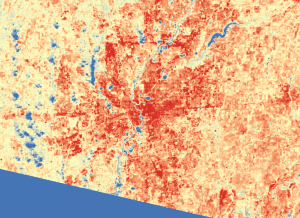
One thing I did not do was preprocess the Landsat 8 data for cloud cover. On the left side of the above image you can see what looks like a series of lakes just to the west of the city. This is a line of clouds, so ideally you would preprocess to reduce cloud cover. The purpose of this was to show urban heat island effect, as can be seen by the darker red of the city compared to the outlying areas. If you were to add a shapefile of the administrative districts, they would follow the outlines of the high-heat areas very closely.

References:

Allen, D. (2011). Getting to know ArcGIS Modelbuilder. Redlands, CA: Esri Press.

Butler, K. (Jan. 6, 2014). Deriving temperature from Landsat 8 thermal bands (TIRS). Retrieved from http://blogs.esri.com/esri/arcgis/2014/01/06/deriving-temperature-from-landsat-8-thermal-bands-tirs/

Trapped in the house with the wife and two dogs during this recent winter storm, I watched the twelve inches of snow blow across the yard into three foot high drifts. I even took a few pictures and posted them to Picasa, you can peruse them at your leisure here (http://bit.ly/K2xQQx).
What does this have to do with geography and GIS you ask? Glad you did, or were going to, or have been led to believe. The same processes that created the snow dunes and keep me from escaping, I mean, taking my wife out, I mean to the store, are the same processes that create the dunes we see in deserts and arid climates. In fact, the area around central Indiana was also created by the same eolian (wind driven) process as created the drifts in my yard. As the glaciers retreated from this area over 12,000 years ago, they left behind all the sediment they had scraped up along the way. The very lightest particles, the silts and clays, were then blown by the wind across the region, creating dunes which were covered with vegetation so that and all that is left behind are the gentle undulations and rolling countryside. So that is why snow dunes are worthy of a geography post. Now if you will excuse me, I hear the snow shovel calling my name again.

Well, the semester is over and it looks like I did very well (current cumulative GPA nudged up to 3.866). Now to kick back for a couple of weeks, enjoy the holidays, and catch up on all the things I got behind on lately.
To kick things off, here is a short video on projections. I saw a clip floating around the Internet from a TV show called the “West Wing” where a group was trying to get the most popular map projection used replaced with theirs, and thought “Hey, maybe I should explain this a little.”
As always, your feedback is welcome.

Short break while I get ready for, and take, finals. Back to posting later this coming week, if I survive.

#GISDay was a great success this year, at least for me. A chance to renew contacts I made last year, meet new ones and hang out with friends all day. Four of us piled into the truck and headed to Bloomington this morning from IUPUI Campus and descended upon the Wells Library at IU. Compared to last year, there was more energy, more talk, and a lot more going on. The big news is the LiDAR data that is in the final stages of post-processing and will be completed this year. This will be LiDAR coverage of the entire state of Indiana, giving everyone in the geospatial community a never-before-seen resolution and accuracy data set. Projects such as subsidence tracking from old mining sites, public health issues, and forestry applications, both urban and rural, are just a few of the projects overheard or talked about today.

Thanks to my traveling companions for making the trip to and from a lot more interesting, and to all those who took their time to talk with us and share the GIS experience.

Now if I can just scrape together the cash for a trip to the ESRI UC this summer I will be all set . . .

Autism Spectrum Disorder (ASD) in Indiana schoolchildren appears to follow the same trend as that reported by the CDC with roughly two percent of the children enrolled in Indiana Public Schools reported as having been diagnosed with an ASD.

For my research methods and stats modeling class this semester, we are required to write a research proposal. For this project I chose to look at autism rates in Indiana due to having the data readily at hand from an earlier request to the Indiana Department of Education (IDOE), and also because I am taking an Intro to Epidemiology class. The idea is to take a geospatial look at the distribution of children enrolled in the Indiana Public School system that have been reported as having been diagnosed with an ASD. I was able to get a polygon shapefile of the school districts in Indiana and joined that with the table sent to me by IDOE. The data from IDOE only shows school district and a count of children reported to have an ASD. In the reporting, if a school district had less than 5 children, no data was reported. For these districts, the null value was replaced with 2.5, which is half the minimum reported value. This is the same technique used by other projects I have worked on. This allowed me to create a quick map of the “observed” ASD rates reported for each school district as shown in Figure 1.

Figure 1 - Observed ASD by School District

Figure 1 – Observed ASD by School District

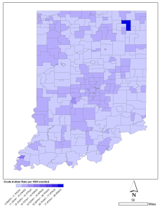
This map shows the reported values, without any adjustment, just the raw numbers. It shows clusters of higher rates around Marion, Allen, St Joseph, and Vigo counties. But are there really clusters in these areas? We need to look deeper into the data and adjust these raw numbers for enrollment, as schools with significantly higher numbers of students, should naturally reflect a higher number of children with an ASD. So in Figure 2 we have the same data mapped out using the crude rate of number of children diagnosed per 1000 enrolled children per school district.

Figure 2 - Crude ASD rate per 1000 Enrolled Students

Figure 2 – Crude ASD rate per 1000 Enrolled Students

Now we see much less variation across the state, but there is still what appears to be a clustering in several areas. The very dark blue up near Ft Wayne and the other nearly as dark near Evansville are outliers and very well could be an incorrectly entered counts. I would need to recheck these with the IDOE to verify. So, is this the whole story? Well, it could be, but there is another technique we can apply to look even deeper at the data. We can use an empirical Bayesian estimation method. This method takes into account the ASD rate and variance of the surrounding school districts to adjust the value for each district. We do this because we really want to see what the dispersion is across the state without the manmade district lines. In Figure 3 we see the result of the Bayesian analysis.

Figure 3 - Bayes Adjusted ASD rate

Figure 3 – Bayes Adjusted ASD rate

Now we see a relatively even and fairly random pattern, meaning that ASD is fairly evenly dispersed across the state. The effect of the two previously reported outliers is clearly evident and needs to be addressed as to whether the data was reported accurately for those two locations. If I were doing this as a thesis/dissertation, I would contact the IDOE and we could compared the reported values with the previous year’s values to see if it is a significant change.

The idea for this post is to show how important it is to look critically at charts, graphs and maps that are presented in reports, and especially in the media, as to how they present the data. Are they showing us raw numbers, crude rates, or something else? The crude rate is very often used as it is quick, easy, and does a good job of reflecting the data, whereas the Bayesian method is much more time consuming and therefore costly, even though it does the best job of reporting data like this as it looks at the data more spatially. It all depends on the needs and questions the research is trying to answer.

Cartography and Ringmaps

Posted: November 9, 2013 in GIS
Tags: , , , , ,

The latest issue of ArcUser magazine (Fall 2013) has a great article and step-by-step instructions on how to create ringmaps (see “Looking at Temporal Changes”) along with a toolbox that can be added in to ArcMap. The article is well written and the toolbox that goes along with it is very clean, simple, and quick. The thing to watch for, especially with these kinds of maps, is the cartography. Making the map is great, but getting the right symbology, legends, etc. on the map is also critical, and ringmaps have some unique features.

The first and most obvious are the rings themselves. Identifying what each ring stands for is very helpful. In the example I created based off of the article, the inner ring stands for 2006 data and the outer ring for 2010, but how best to show it? I chose to insert the years into the rightmost rings themselves as text objects. This denotes them without detracting from the map or taking up space with another legend item. Another issue that has to be watched is the polylines that connect the rings to the map. I converted these to graphics and then adjusted them. I also annotated the labels for the counties and adjusted both these and the polylines to be as near the center of the county as practicle, but also watch and make sure that no two polylines crossed near where on ended, making sure it was clear where each line ended. I added the standard north arrow (I went fancy here just for show, the simpler the better with north arrows), the small text and information on where the data came from, and a scale. The scale in this case is not really necessary, but fills in some extra whitespace and helps balance the area. The last item is the legend. Ringmaps are mostly used to show trends, as this one does, so having the actual values in the legend is not as important as identifying the trend. In that case, I went with a low to high method which simplified the legend, helps the reader understand the trend, and makes for a cleaner design. If this was being used in a research paper or report, then I would assume the actual numbers would be found in a table or discussed in the body of the text.

Ringmaps are great and I have plans to use them in a upcoming paper I am working on and so this article and toolbox was very helpful and timely. The things I have shown here are not the only or best way, but work well for me. Try it yourself and let me know what results you come up with and where you see I could improve on this one.

test

What do you see in the image below? A series of black blobs, or the words MAIL BOX?

mailbox


I recently started reading the book “Gödel, Escher, Back: an Eternal Golden Braid” by Douglas Hofstadter, and Chapter III really got me thinking. The chapter is on Figure and Ground, which mainly relates to art where the figure is the subject of the artwork and the ground is the background. Hofstadter’s book, though, is not so much about art as it is about logic and the way we think and perceive the world.

I started thinking about figure and ground from a geospatial point of view. As an example, let’s say we are analyzing an area of interest trying to determine a specific type of habitat or feature. Depending on the type of analysis, the features we are looking for may be small, complex, or not neatly defined. But what if we looked at it from the point of view of what is not our target feature? Then, like in the image above, the ground becomes the figure and the figure becomes the ground. Similar to the way astronomers used to look at the glass plate exposures from their telescopes. They would look at the negative image where the stars were black on a clear or white background, thereby making them easier to see because of the contrast. Using this same idea applied to geospatial analysis, in some cases, might useful in highlighting the areas we are interested in by looking at what it is not.

References

Hofstadter, D. R. (2000). Gödel, Escher, Bach: An eternal golden braid : 20th-aniversary edition with a new preface by the author. N.Y: Penguin Books.